ASYMMETRIC DESIGNS
Share
The definition of asymmetry is the lack of symmetry or equality between two halves. However, it is not the lack of balance as some wrongly assume. Asymmetric designs can be attention grabbing and thought provoking. The design technique is difficult to master due to the need for balance and using the space effectively. At LORD INT, the aim from the very beginning was to create eye-catching designs which may not have been commonly seen on streetwear. This meant the implementation of asymmetric yet balanced designs was an important design tool to consider.
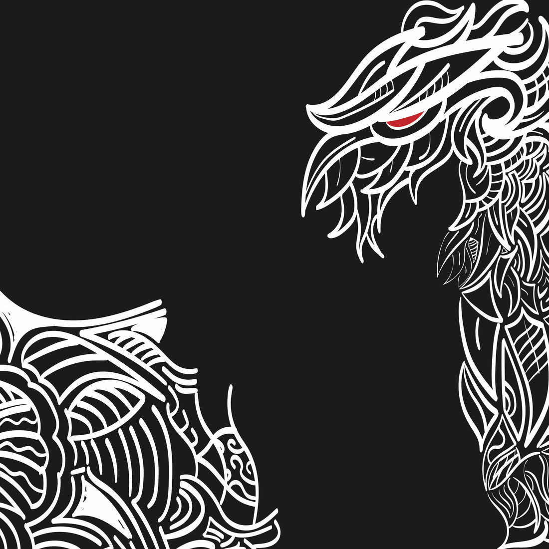
Considering the designs of EDITION 3, the most distinct asymmetric collection so far. A key determining factor behind this was to create an aggressive yet stylish design language to implement the history of Tribal Art and its origination as an indicator of social status and designation within a tribe. However, an important use of tribal art in modern context is tattoos, which are rarely ever symmetrical. This presented a perfect opportunity to create a distinct, asymmetric effect. However, the design needed to be balanced as the contrasting colours would mean an imbalance is highlighted further and creates a non-aesthetically pleasing clash. The balance was created using a half tribal sleeve originating from the elbow, at a slight angle. The desired effect of this design choice was to effectively create an illusion of balance and completion as the sleeve resembled being cut from the main design piece.
The use of asymmetric design is still highly unconventional as the use of symmetry and proportions are a more commonly accepted design choice. However, asymmetric designs create an instantly distinct look due to the initial conflict it creates. This clash makes the designs more recognisable and memorable while promoting balance if implemented correctly.

